Bright Money.
Years
2020 - 2022
Role
Senior founding product designer/Lead product designer.
Scope
Product Strategy, UI/UX, Design system, Customer Development
Product
Bright is an AI-powered app designed to help users manage and repay debt while building credit. It consolidates multiple debts into a single, manageable credit line of up to $8,000, allowing for simplified payments and improved financial control. The app also helps users build their credit, along with personalized budgeting and savings plans. Additionally, Bright provides expert financial tips and resources to guide users toward smarter money management.
Objective
The primary objective was to develop a unified financial management app that consolidates debt, automates savings, and aids in credit building. The goal was to create a user-friendly platform that effectively addresses the pain points identified in competitor offerings, ensuring a seamless financial management experience for users.
Challenge
Limited to a web-only version
Low user retention
Ineffective UX, resulting in low task completion and user frustration
Low onboarding conversion rate
Increasing cancellation rate
Research
& Discovery
In this phase, I focused on understanding user needs, market trends, and competitive advantages. Here's the process:
Competitive Analysis: Reviewed major competitors to identify gaps and strengths. Key findings informed features like budgeting tools, debt management, and personalized advice.
User Research:
Target Audience: Identified users struggling with debt, savings, or credit scores.
Surveys & Interviews: Gathered insights to define pain points and user personas.
User Goals: Common goals included reducing debt, improving credit scores, and building savings.
Market Research: Studied FinTech trends, AI-powered solutions, and regulatory requirements for financial services.
Problem Definition: Defined the core problem—users need a simple, AI-driven platform to manage debt, savings, and credit.
User Personas: Created personas based on user research, representing various financial needs.
Feature Prioritization: Prioritized features like AI debt strategies, automated savings, and credit-building tools.
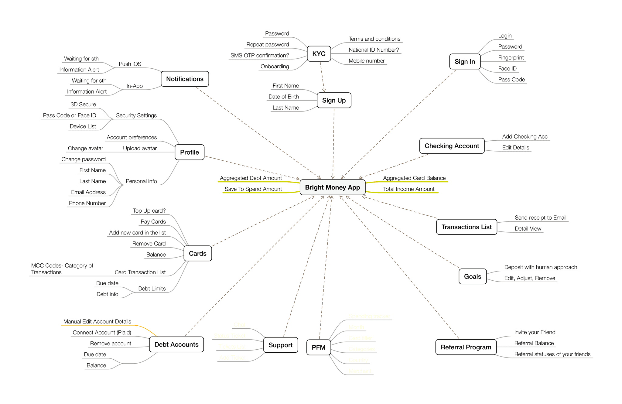
Information Architecture
Content was structured into clear sections: Dashboard, Debt Management, Savings, and Credit Building. User flows were designed to reduce complexity, ensuring seamless navigation and interaction.
User Research
Gathered insights through interviews, surveys, and persona development.
Personas:
Primary: Individuals managing multiple credit card debts.
Secondary: Users wanting to automate savings and improve credit.
Methods:
Interviews: Identified pain points in debt and savings management.
Surveys: Highlighted user priorities—automation, clarity, and personalized advice.
Findings:
Users found tools fragmented and wanted automated solutions for easier financial management.
Solution Ideation
Based on research findings, I proposed the following solutions:
Core Solutions:
AI-Driven Debt Management: Automatically consolidate and manage debts using AI to offer optimized repayment plans.
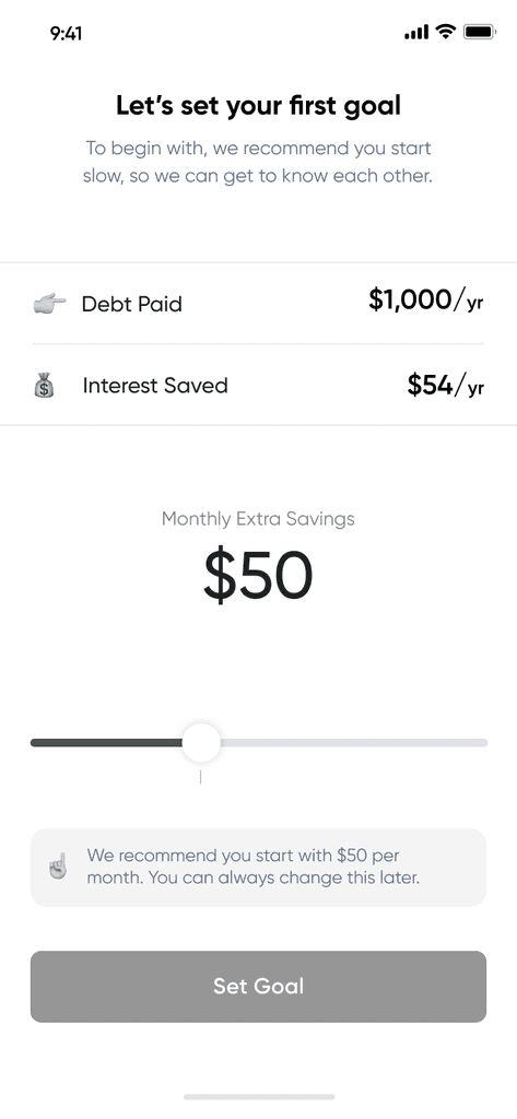
Automated Savings: Set up savings goals with automated contributions based on users' income and spending patterns.
Credit Building: Report on-time debt payments to credit agencies and offer credit score tracking.
Feature Prioritization:
Prioritized features that offered the most user impact—starting with debt management and credit-building tools, followed by savings automation.
Design and Prototyping
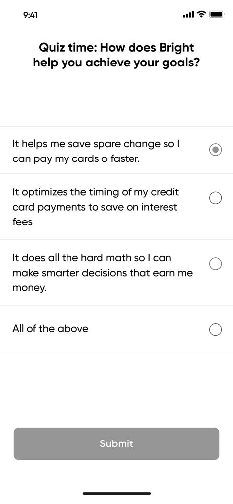
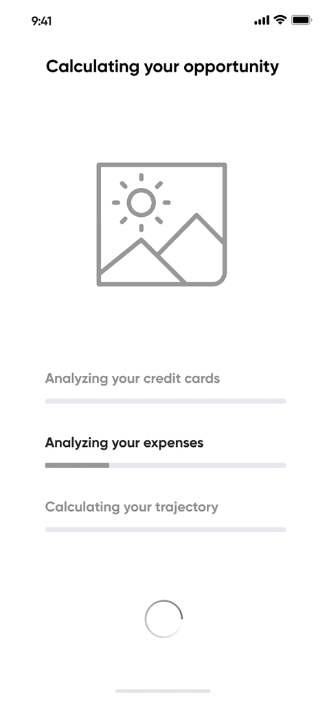
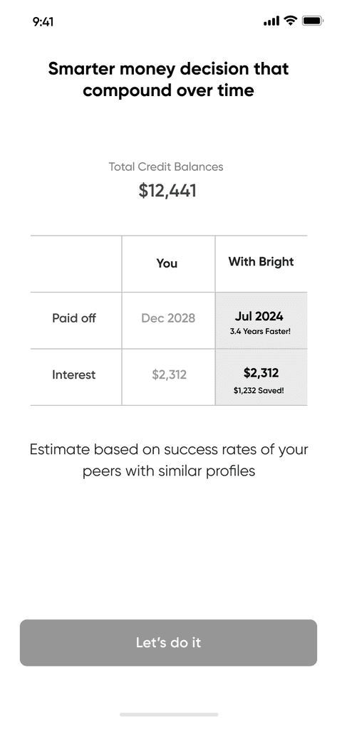
We сreated visual representations of the app's structure and user flows.
Wireframes:
Developed low-fidelity wireframes for key screens like the dashboard, debt management, and savings tracker with a focus on minimal, intuitive design.
Prototyping:
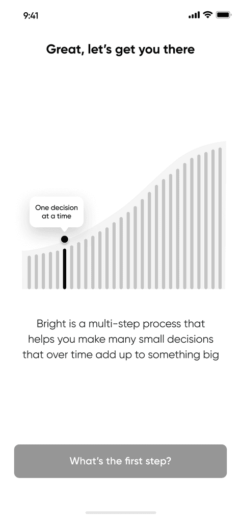
Built high-fidelity prototypes to simulate user interactions, ensuring the process of entering financial data was simple and user-friendly.

User Testing & Feedback
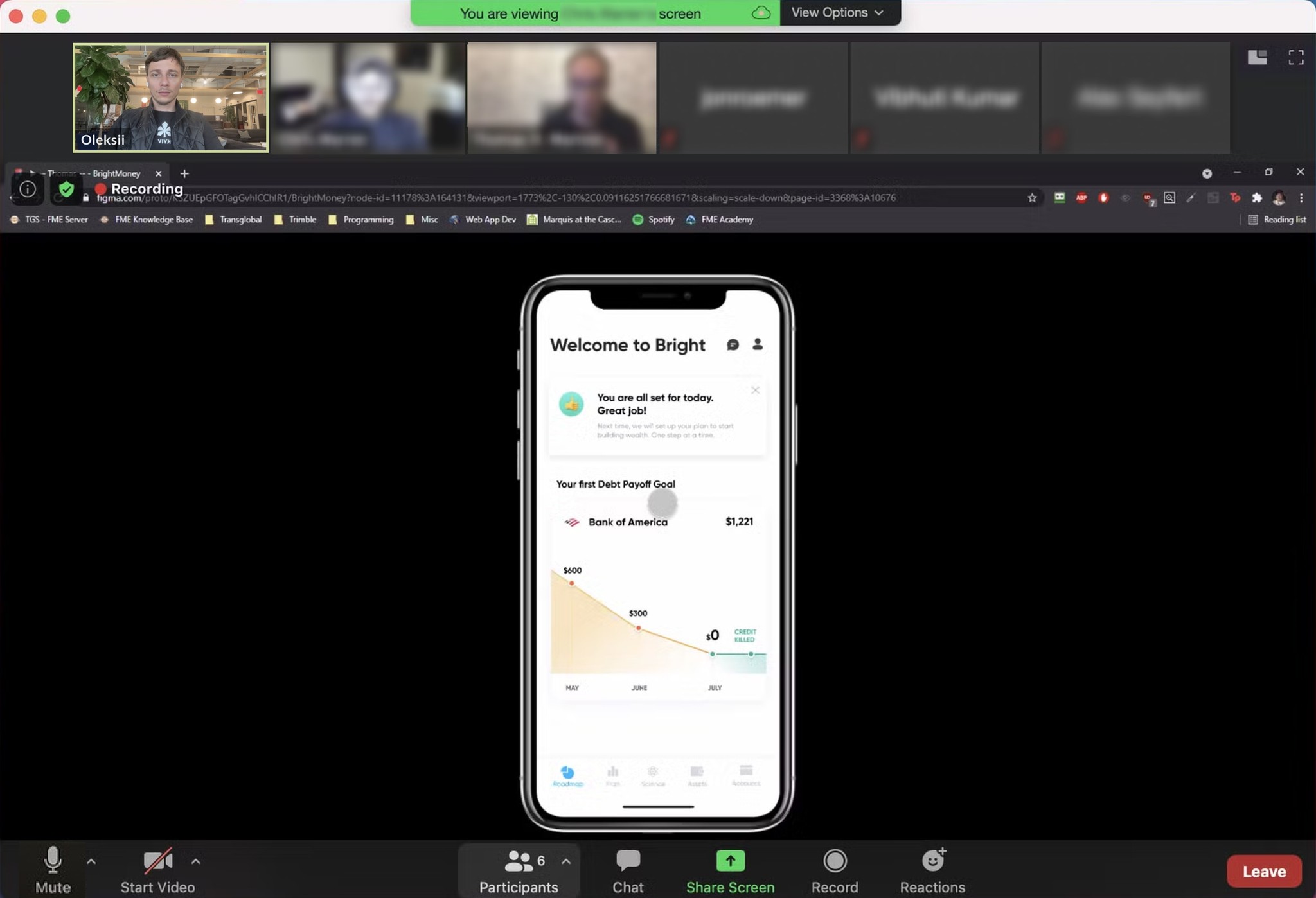
During the User Testing & Feedback phase, prototypes were tested with real users to gather insights on usability, functionality, and overall experience.
Usability Testing:
Conducted tests with users fitting the identified personas to observe how they interacted with the prototype.
Key Insights:
Users loved the ease of automation but wanted clearer guidance on financial decisions made by AI.
The onboarding process needed more transparency in terms of how debt consolidation works.
Iterative Improvements:
Enhanced the onboarding process with more educational touchpoints explaining how AI consolidates debt and builds savings.
Added visual progress indicators to provide more immediate feedback on debt repayment and credit improvements.
Implementation
The final design was built and integrated into development.
Development:
Worked with developers to ensure accurate design translation and optimized app performance.
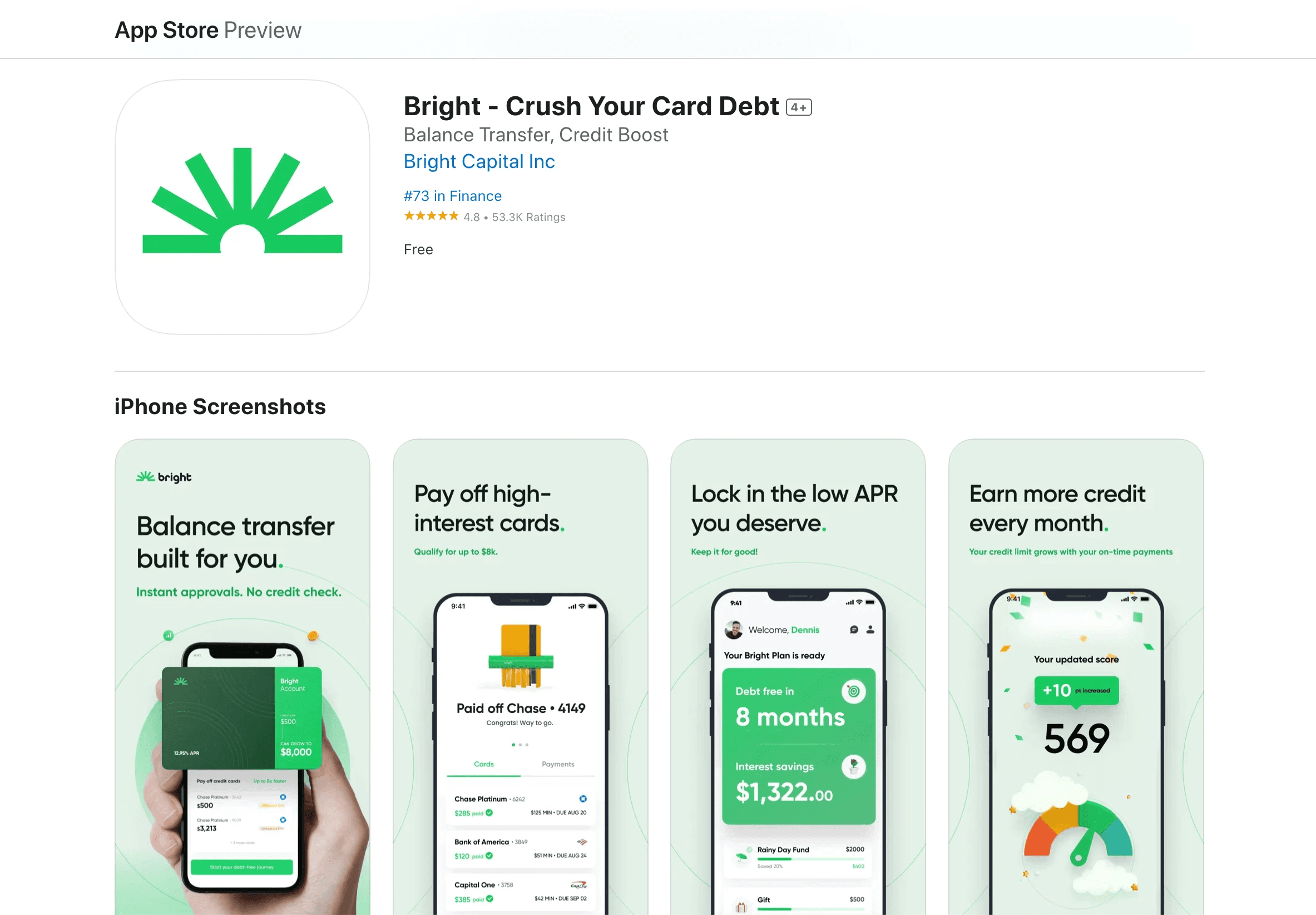
Rollout: Launched the revamped visual design and product updates across all platforms (iOS, Android, Web) in stages to monitor performance and handle any issues.
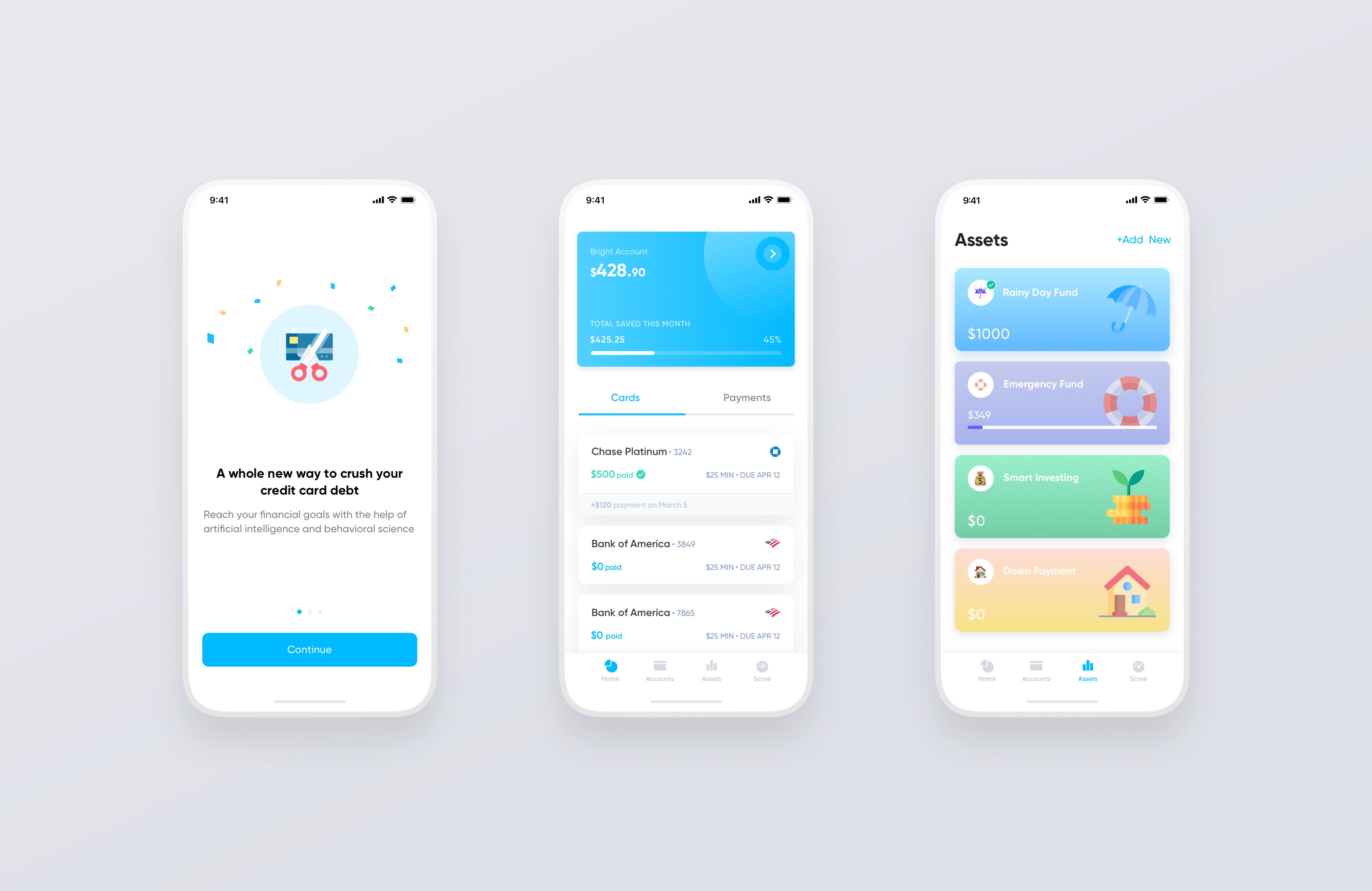
Before
Low onboarding conversion rates
Inconsistent Layout (Missed H1 on the Home Page)
Ineffective UX, resulting in low task completion and user frustration
Low Home screen retention rate
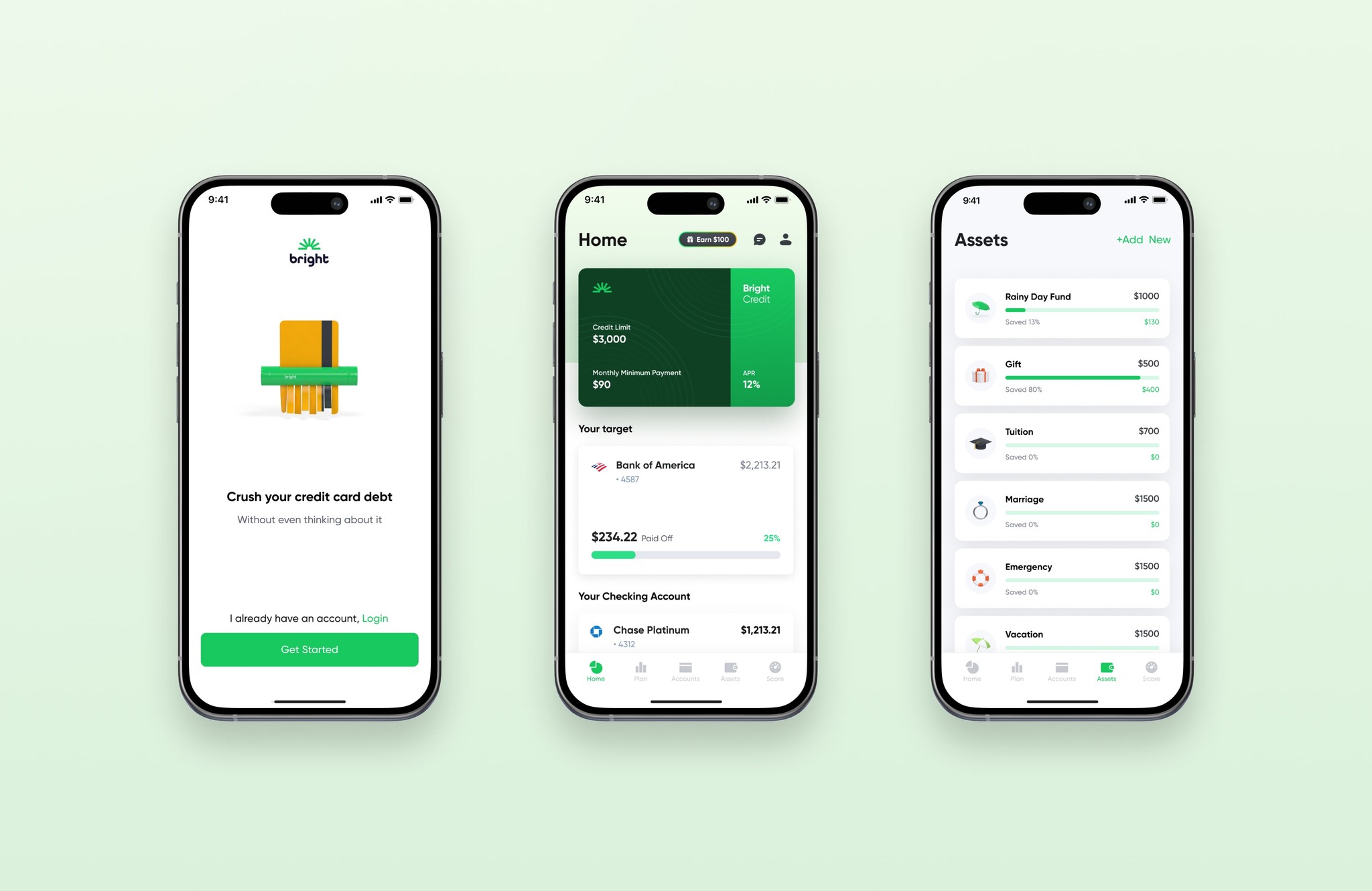
After
Low onboarding conversion rates was increased by using functional animations that guide users by prompting and explaining the required actions.. we revamped the onboarding process to make it more engaging, straightforward, and appealing.
Added an H1 to the Home Page and developed a design system to ensure consistency across all layouts.
Added visual anchor (Card), and moved the Payments tab to the bottom.
Adding additional blocks to the home screen, such as your target, checking accounts graph, upcoming payments, and low home screen retention rate, has increased.
Outcomes
Increased Retention Rate:
The product initially struggled with low retention due to poor engagement. After introducing user-friendly designs and AI-powered debt management, retention improved by 24%, with session lengths increasing by 40%.
Improved Task Completion:
Poor UX led to low task completion rates. By streamlining flows and adding AI-driven automation, key tasks like debt consolidation saw a 35% improvement, with a significant boost in user satisfaction.Enhanced Onboarding:
A complex onboarding process caused high drop-offs. Simplified onboarding, personalized steps, and educational touchpoints boosted completion rates by 50%, increasing user confidence.Lower Cancellation Rate:
High cancellations were reduced by 30% after clearer value communication and personalized recommendations, making users more likely to stay.Better User Experience:
The app gained 500K active users and saw significant growth in MAU and DAU, indicating higher satisfaction and engagement.
Illustrations & Animations
Collaborating with a 3D designer, we developed the style for illustrations and animations, resulting in a comprehensive 3d library of functional and marketing visuals.
The functional animations guide users by prompting and explaining the required actions.
Summary
The BrightMoney app successfully combined debt management, credit-building, and savings automation into a simple, user-first platform, distinguishing it from competitors and meeting real user needs.